I am not a huge brand name buyer, however, it is something that I take into consideration. For example, I love to buy jeans and shirts whenever we go to the outlets. If we're going to go shop for jeans, the first thing I think about is prices. I will almost always go to say, Tommy Hilfiger, rather than Levi's, simply because of the price difference. But if two stores have the same prices, I'm going to go with the more popular company's product. When it comes to shirts, I also do the same, but I also go for brand names first, such as Calvin Klein because they're easily recognizable brands with well made products.
I also love to buy video games. I'm not a big tech guy but when I buy video games, popularity, advertisements, and the company that created the game are taken into consideration very heavily. So advertisements do play a big part, and some sort of sale will make me run over as soon as possible. Generally, it's all about popularity and advertising. I will also buy games that aren't as popular but if it's something immensely famous then I will almost always go out and buy. Lasting value is another big thing when shopping, be it for clothes or games.
Friday, December 3, 2010
Tuesday, November 30, 2010

Layout
1. Describe the layout of the advertisement. How is content arranged? For example, are elements arranged symmetrically or asymmetrically?
The advertisement shows various products from the company arranged randomly. The elements are arranged asymmetrically.
The advertisement shows various products from the company arranged randomly. The elements are arranged asymmetrically.
2. Describe the relationship between the written (copy) and graphic elements of the advertisement.
All text is placed right next to the image to show what it's about. For example, the Sandwich Wonder-izer bread has the text right next to you to let you know exactly what it is.
All text is placed right next to the image to show what it's about. For example, the Sandwich Wonder-izer bread has the text right next to you to let you know exactly what it is.
3. How does the advertisement use page space? Is the advertisement full of text and graphics or does it have a lot of white space?
There isn't all that much white space at all. It shows everything put together, some elements overlapping, but it's done in a way that you can still tell what everything is.
There isn't all that much white space at all. It shows everything put together, some elements overlapping, but it's done in a way that you can still tell what everything is.
4. How does the advertisement use alignment to organize its information?
Nothing is really aligned at all. But I actually find this to be a little bit better, because it gives the illusion that the company is full of tons of products and things to offer.
Nothing is really aligned at all. But I actually find this to be a little bit better, because it gives the illusion that the company is full of tons of products and things to offer.
Colors and graphics
1. Describe the colors used on the advertisement. Do they work well together? Is there a high contrast ratio between text and background?
All the colors match with the Wonder Bread logo, which has good color choices, so they work together. There is a good contrast ratio between text and the background it's placed on, making things easy to read.
All the colors match with the Wonder Bread logo, which has good color choices, so they work together. There is a good contrast ratio between text and the background it's placed on, making things easy to read.
2. Does the color scheme add to the purpose or tone of the advertisement? What tone or message do these colors convey?
The colors are bright and it lets you know that it's not something so very business like. It does add to the advertisement, because it lets you know that bread is not something to be taken so incredibly seriously.
The colors are bright and it lets you know that it's not something so very business like. It does add to the advertisement, because it lets you know that bread is not something to be taken so incredibly seriously.
3. Is a photograph used in the advertisement? If so, what kind of shot is it? What angle is it taken from? What is the lighting like? How is color used?
Most of it is photography, and it's taken at a very simple angle that will just show you what the company has to offer, whether it be food or recipes. There isn't any special lighting or effects, just something to show things off.
Most of it is photography, and it's taken at a very simple angle that will just show you what the company has to offer, whether it be food or recipes. There isn't any special lighting or effects, just something to show things off.
4. If people or animals are in the advertisement, how would you describe them? What are they doing?
There are people smiling, probably just to show that this bread is so awesome it will make you astoundingly happy with your family.
There are people smiling, probably just to show that this bread is so awesome it will make you astoundingly happy with your family.
5. What is the background of this advertisement? That is, where does it “take place”?
There is no background other than blank white.
There is no background other than blank white.
6. What “story” do you think this advertisement is trying to tell?
It's not really telling a story at all. It just shows what the company has to offer you.
It's not really telling a story at all. It just shows what the company has to offer you.
Typography
1. Describe the font(s) used for each element of the advertisement. How does the advertisement use typography to distinguish among different elements (create hierarchy or emphasize a message)?
There is not really a layout at all. There is no hierarchy at all in my opinion, however, one may argue that the designer made certain items bigger than others in order to show that they are more important.
There is not really a layout at all. There is no hierarchy at all in my opinion, however, one may argue that the designer made certain items bigger than others in order to show that they are more important.
2. Describe the font families used (name them if you can). What messages do these font families convey?
I don't think that I know the font family, but it is very simple and is used only to show you know what certain things the company can offer, such as the obvious "Products".
I don't think that I know the font family, but it is very simple and is used only to show you know what certain things the company can offer, such as the obvious "Products".
3. Can you see what kind of typographical formatting has been applied (tracking, kerning, leading, and so on)? What impact do these formatting elements have on the advertisement?
No formatting has been applied. The only thing that comes to mind at all is putting the text along the images to make them more easy to associate with that image.
No formatting has been applied. The only thing that comes to mind at all is putting the text along the images to make them more easy to associate with that image.
Tone
1. How would you describe the overall feeling of this ad? What word would you use to describe it? For example, is it playful? Serious? Urgent? Hip? Glamorous? Friendly? Patriotic?
It feels friendly. The advertisement does not give me the illusion that I need to get up, run to the supermarket, and buy Wonder Bread or else I'll die, but with use of color, the images, and the way everything is arranged, it's very simple. The smiling people also give a friendly feeling.
It feels friendly. The advertisement does not give me the illusion that I need to get up, run to the supermarket, and buy Wonder Bread or else I'll die, but with use of color, the images, and the way everything is arranged, it's very simple. The smiling people also give a friendly feeling.
2. Who is this advertisement aimed at? What message does the design convey about the audience and the client that commissioned it? About the product or service?
This advertisement is aimed at everyone. The design is simple enough for anyone to look at and see that it isn't aimed at say, businessmen only, or people out of work, but rather, to anyone who just wants to eat bread. Whoever came up with the idea was aware that not only a certain group of people is able to enjoy bread, but everyone is. The product is also for everyone, but that's not something I know because of the advertisement, but is just painfully obvious. Bread, like water, has always been for everyone to enjoy.
This advertisement is aimed at everyone. The design is simple enough for anyone to look at and see that it isn't aimed at say, businessmen only, or people out of work, but rather, to anyone who just wants to eat bread. Whoever came up with the idea was aware that not only a certain group of people is able to enjoy bread, but everyone is. The product is also for everyone, but that's not something I know because of the advertisement, but is just painfully obvious. Bread, like water, has always been for everyone to enjoy.
3. How does the graphic design (balance, emphasis, color, tone, and so on) communicate the content?
Everything is in harmony. There are no random colors that stand out from everything else. The elements are balanced and there isn't much emphasis on anything over anything else.
Everything is in harmony. There are no random colors that stand out from everything else. The elements are balanced and there isn't much emphasis on anything over anything else.
Friday, November 19, 2010
Project 3 Reflection

1. What were your initial goals for the business card?
I wanted to make a business card incorporating my logo that had a very simple design. I planned to use a very subtle background image in order to approve the overall appearance of the card, but I never got to do that as it would be very time consuming.
2. Does the business card you have match the initial goals? Why or why not?
It does, in some ways. As I said before, the whole plan with the background image never went through. The layout is also completely different from the one I originally went with. I had to change it because everything was too squished together. However, for the most part, my goals were fulfilled. I have a background gradient color, my logo, and everything is the same color, save for some words in the slogan.
3. Do you have new goals in mind for the business card? If so, what are these and why are you changing your goals?
If we were still doing the project, I would have liked to get the background image done, which would occupy the bottom right of the card. It would look better and make the card less boring. Everything else I am satisfied with.
4. What design concepts and principles did you originally incorporate into the business card?
As is my usual philosophy, I was trying to create a memorable and simple design with a small amount of shapes and crazy backgrounds and effects. I wanted a stark contrast between the colors of the background and the text itself, and I wanted to make my logo the biggest and most obvious element on the card.
5. Do you want to include new design concepts or principles in your business card? If so, what are they and why do you want to include them?
Well the project is over, but when I was thinking about this, I had to compensate for the lack of time to create a background image, so I came up with the idea of a background color. This color, however, went together a little too well with my logo, so I had to make some changes. I also had to change the text color to create more legible text and the layout had to change too, just because I thought it was really crappy in general.
6. What do you need to make to account for the new design concepts and principles? Sketch your changes below in addition to writing them.
I actually had to go into Photoshop and revise my logo to fit the new color scheme. I changed the colors on my logo in a way I thought would fit the business card better, as well as make the colors stand out more in the background.
Thursday, November 4, 2010
Project 2 Reflection
I came up with the idea for my logo through simple thinking. I believe an effective logo comes with a very minimalist attitude in designing, and I believe that is reflected in my logo. I thought of gaming sites, which often have logos that are something simple like a D-Pad or a joystick, so I went with buttons. It's memorable, simple, and doesn't require tons of colors and effects.
The most evident design principles are shapes and use of color (or lack thereof). The D-Pad was not a premade shape. I actually constructed a very realistic looking D-Pad using various shapes within the main plus shape and effects on these shapes. The effects are so effective (no pun intended) that if you remove them, it actually looks like there's nothing there. I also used an effect on one of the buttons to make it look like it was being pressed down on. There is also a lack of color, save for where it is most needed, in order to stand out in stark contrast from the rest of the logo. With that simple strategy I can make what needs to be noticeable very obvious, without using dumb flashy colors and effects all over the place.
Vector and bitmap images hardly affected my design. Bitmap or not it would likely look the same. It had a very minuscule role in assuring that my sizes didn't look a hint blurrier than it should have, but the sizes are small enough that there would have been no difference. I'm sure that if you removed the vector mask from all of my layers, the logo would look identical. There's nothing in my logo that would look different had it been done with bitmap images.
My vision was simple; make the D-Pad and buttons, and make one of the buttons look as though it was being pressed down on. Around the redesign period, I started making some changes. I realized that the effects on the text looked overdone and it didn't make any sense considering that the logo was supposed to look simple. Second, the mashing effect on the D-Pad was really bad. By my first draft, the mashing effect had already been fixed, but only within the last few moments of the period. I also had a ton of effects on every shape that looked extremely amateurish, and it turns out that without them, my logo looked much better. With everything toned down to look more professional, however, it was very boring. So the biggest change (albeit quite a subtle one) at the redesign period was my decision to use Photoshop's extensive custom brush options to create a brush effect that would add to the two most important elements of my logo, these being the mash effect and the text. So after a ton of testing, I found some good brushes and made it look good. Truth be told it is not a massive difference, but I think it does increase the overall quality of the logo by a lot.
Monday, October 25, 2010
Bitmap and Vector Images
1. A bitmap image is an image made up of various individual pixels of different colors, all put together. For example, everything on the computer screen right now is made up of pixels, so it is essentially a bitmap.
2. Resolution-dependent means that the quality and size of the image depend on how many pixels are in every inch of your monitor. The more pixels per inch, the better the image will look.
3. A vector image relies on mathematical equations to determine how all the lines will appear on the screen, instead of individual pixels being put together.
4. It's easy to notice a difference because bitmap images don't scale very well, since all you're doing is increasing the size of the pixels. However, since vector images rely on equations, the image probably knows it's growing and will adjust the equation accordingly, to keep the quality good. Also, in general, vector images look sharper and more "cartoony" for lack of a better word.
Thursday, October 21, 2010
Google Logo Reflection

Photoshop Printing Management Options
These are the 3 different options I selected for color settings.


This is the image I took that shows what happened after I changed the format from RGB to CMYK.

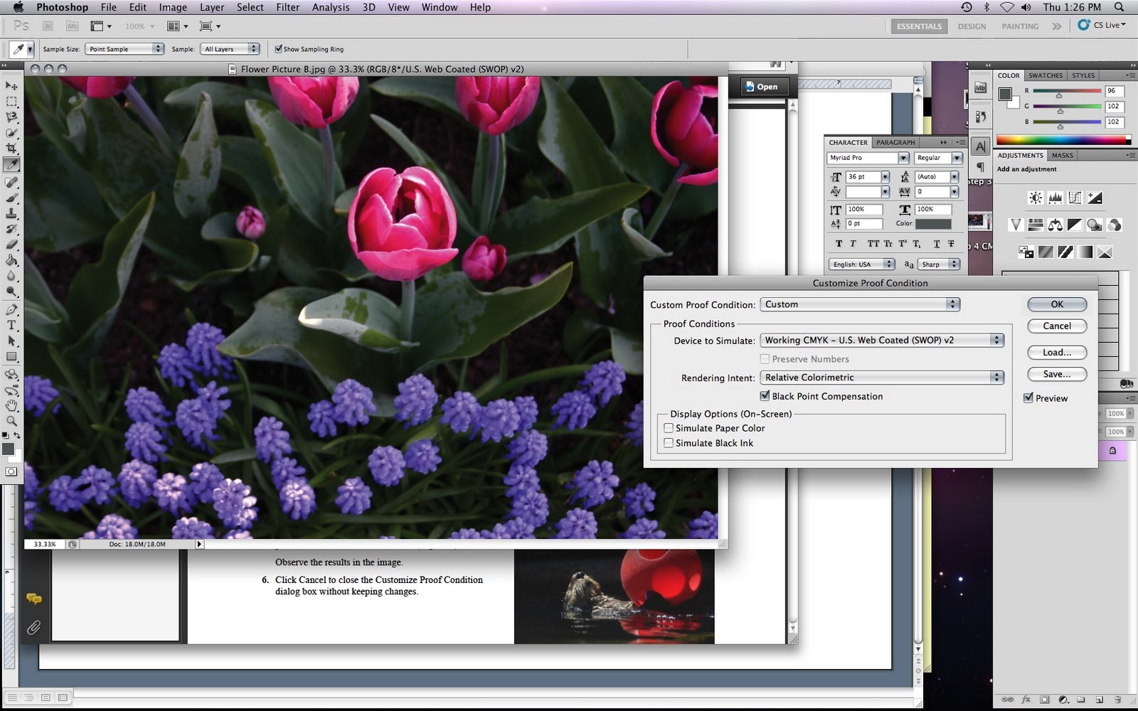
This shows what happens before and after I changed the proof condition from the default to Kodak.

These are the two different options I used in the color management options for printing.


Tuesday, October 19, 2010
Design Principles
Emphasis and contrast are the stress put on a certain thing (or a few things) in order to make them stand out from the rest.
Proximity and groupings are finding the right distance between certain things in your logo to create a good balance.
Balance is the use of the space you have, deciding where the right spot is to place certain colors (or no colors at all), text, and images, to find the right contrast between things.
Alignment is the placement of a certain thing in the image in relation to the other things. For example, things that are aligned would all be set up straight in a row, and if they were not aligned, they'd be out of place.
Do Now: List the basic design elements
The basic graphic design elements are color, shape, line, and texture.
Monday, October 18, 2010
My Color Pallet

I chose the colors, from left to right, orange, dark orange, dark pink, purple, and dark purple. I chose these colors because they resemble the colors of the sunset and the sunrise, which I think are very nice. Additionally, they are some of my favorite colors. The ability to change everything individually, including the hue, tint, and chroma, helped me get the right balance of colors from the sunset and colors that I liked. For example, the real colors are a bit brighter, but I chose darker colors because I just thought they looked better.
Tuesday, October 12, 2010
My experience with the blog - Project 1 Reflection
The objective of the assignment was to create our own collage. The collage had to consist of 10-30 pictures, with at least 50% of them being pictures taken by you. I ended up deciding to use 9 pictures taken by me, and another 9 from the internet. The pictures I took basically consisted of tech things, since they are easy to take as opposed to pictures of other things I like, like certain bands and sports. I took pictures of things like myself, my best friend, my phone, and my computer/gaming console, since that's pretty much my life when you get right down to it.
The project basically turned out the way I thought it would. I set out with the vision to create a collage within an old 8-bit mushroom from the old Mario games. It looks poorly made and pixellated, but I assure you, it was completely intentional. I used various adjustments to improve the quality of the individual pictures as well. The hard part was making sure that every single image was clearly visible, being that it was difficult to fit every image and make them clear when all of them are overlapping. I really don't think I would have done anything differently if I were to re-do the project, since it came out as I intended it to.
Subscribe to:
Comments (Atom)